First some scrappy layouts I’ve made lately, but neglected to share here on the blog – not happy with all of them, but..
Ok, I’m happy with how this one turned out. It was for Fancy Pants Designs’ productshowcase of the Vintage Valentine Cards & Strips. I used the strips-paper as my background, gessoing the edges before going over them with distress ink. Think it contributes to the dreamy look on the layout. The cards were cut out and sewn upon a background-sheet from the same line, with it’s edges distressed. On the bottom behind the card-sheet you can see this blueish glitter cut. It’s gorgeous and I thought it’d be nice to anchor the sheet with cards with it. Some tulle, feathers, a 7gyspsies-key and a SIIC-center from Prima and some tags with journaling makes this layout complete :)
A Hambly-layout where I apparently went a bit (too?) wild with the colors. Well, I honestly think it looks nice irl, but there’s something with this purple cardstock & pink rubon-combo which makes it look a bit weird when being photographed – it looks too neonish…? It kind of hurts my eyes – or is it just me?? It looks awesome irl though, trust meeee (or well, I do like how it appears irl much much better than in photo) ;p I made this layout based on Dina Wakleys sketch for Pencil-Lines. The woman on the pictures with me? A dear scrappy friend *waves if you see this* :) I’m glad you’re in my life & that you “get” the silly me :)
Love this Prima-flower!! :) It was sprayed with glimmer mist, but it doesn’t really show here (bleh). 
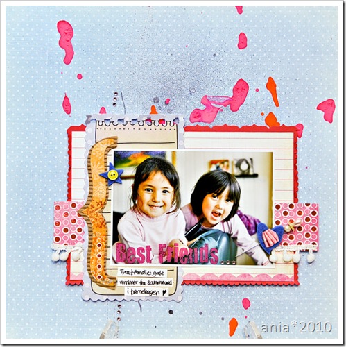
More play with paintsplatters & glimmer mist. I used papers from the new “Frosted” line from Fancy Pants Designs (love the vibrant, happy colors :) ), a journalingsheet from the “Dancing Girl” line, and various bits and pieces. This is my daughter and her best friend from kindergarten :)


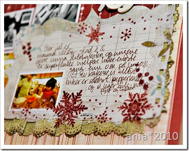
Oops! Thought I was caught up but forgot this one :) I made it for the product-spotlight on the Christmas Magic glitter cuts :)

Mkay.
I had a little more to share than I thought – but – I think I should be caught up now at least.
Guess I’ll share the photos I did for ISS in a new post tomorrow (a freelance-gig I did earlier last fall which I’m sort of proud of :) ) since this post turned out to be a long one :p
The kids are making waffles in the background, I have my glass of wine (♥), there’s fire in the fireplace and I think I’m gonna do some more scrapping tonight! :)
Have a nice weekend :)


