Welcome to another old tutorial I’ve dug up for you :)
It was originally posted at the Hambly Screenprints-blog October 2009 – the original post can be found here.
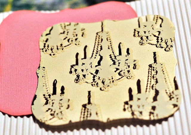
I simply love the fact that Hambly repeats the same designs with some of their papers, transparencies and rub-ons. It gives you such amazing opportunities to really play with three-dimensionality and create the illusion of shadowing within the design!
I’ll illustrate an example with this card. To duplicate this card, you’ll need:
- White (corrugated) cardstock
- Pink cardstock
- Any design that’s available as both transparency *and* paper – here: Mini Chandeliers in Antique White Overlay and Brown Ink on White Gold Metallic Paper
- Mod Circles overlay
- Vellum
- Spellbinders Nestabilities
- Pop-up glue dots
- Needle and yarnPick up the Mini Chandeliers transparency and paper. Placing the transparency above the paper, determine which direction and how much “shadow” you want by skewing the transparency some.
Cut out a large enough piece for your diecut-machine and cut out the piece needed. I used a cuttlebug and cutting both paper and transparency at once was easy enough – just use a re-positionable adhesive between the transparency and paper to make the skewed position stay in place. Remove the adhesive after the cutting out.If you don't have a die-cut machine you can trace a tag or bracket or chipboard piece to get the shape or design you desire.
Adhere the die-cut on the pink cardstock, and cut around it to create a small, pink edge. Adhere the transparency straight above the paper-version by using pop-up glue dots strategically (behind the chandeliers so they won’t be too visible).
Cut and score a 11,5x5,5” rectangle of the corrugated cardstock. Cut and score 11x4,5” of the mod circles transparency. Cut and score 10x4” of the vellum.
Using a thick needle and some thin yarn, tie the card together with two (or even three or more) holes in the spine and tie the yarn on the outside with a cute bow.
Adhere the die-cut on the front page.
A similar example can be seen in this layout I made earlier this year using rub-ons and transparencies of the same kind of design. Rub-on on bottom and the transparency directly over the rub-on.
Again, I hope you like the idea of having the old tutorials gathered in one place…you can find a list of the tutorials in the sidebar to the right :)
Edited to add: Totally forgot I had this one scheduled for today, so was surprised when this popped up in the reader, haha. Just wanted to add this tidbit, one of my older Hambly-tutorials was featured on the handmade jewellery-club’s webpages. Cool! :)


