Edit: the giveaway has now been closed & winner picked. Comments still open though, in case of question and stuff :)
I’ll be the first one to admit that uh, sketches isn’t really my forte. Not if I *have* to follow it step by step (although in some cases it’s the most simple and actually the best solution). But – if you can allow yourself to handle a sketch quite freely without really feeling you have to do this and that because it’s on the sketch then it can be a wonderful startingpoint. And that’s what it is to me.
It’ll tell me how many pictures and elements I’m supposed to use, then it’s up to me to see during the process depending on what I have for hand if it’s actually necessary having this and that on the layout or if I’ll just ruffle it up and flip and add and deduct and put together and whatever.
Now, that being said – if you’re entering a sketch-contest you might want to double check what’s allowed to do with the sketch – some allows you to flip or mirror the sketch, others are more rigid. If it’s a contest then the rules laid down needs to be followed imho, and you really ought to be able to see on the layout that yeah, it’s the sketch alright – to make it just for everybody.
But if you’re creating just for yourself, just to get your project a flying start – then be my guest – do whatever you want with the starting point!
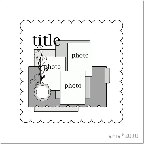
I’ going to share my process of working with a sketch from start to end. My starting point here is this sketch found at page 88 in the new Pencil-Lines Sketch Book by Anna Bowkis, the founder of Pencil-Lines. (You can purchase the book from here and yes, you can also find several of my layouts in the book so yes, this is a bit of self-promotion :) ) It’s a pretty three-photopager with nice elements which can be interpreted two ways – either with the scalloped border as your 12x12” base, or with the larger frame as the 12x12” base. I chose the latter. You can see from Annas example on the same page in the book that she chose the first.
Here’s the original image of the sketch, courtesy of Anna: 


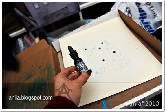
And some glimmer mist to add some more interest to the background. But ofcourse :) Grabbed a brush, shaked and opened the bottle and soaked the brush so I could spray larger splotches on the paper with my fingers running through the brush (not sure if I’m explaining it correct, but I hope you understand what I mean. I mean – this is kindergarten-stuff :) )


For the square background (the scalloped one on the sketch) I decided to go with an oldie but goldie from Hambly Screenprints – a mini graph transparency in black. It would provide a nice background to the pictures I thought, without really taking any focus from the pictures themselves plus still allow the lovely splatterfun on the background to show through. I also decided to handcut the green “Hanging Heliconias” paper – I cut out three strips of them. I like how the Kelly-green color (note to self: obtain more scrappy papers in Kelly-green! Such a lovely color!) compliments the layout.

I decided to staple the strips to the transparency before continuing. (I like to use my staples for pretty much everything. Especially when attaching embellishments that I want to still be a bit loose in the ends sort of.
Decided that my title needed help to stand out on the layout, hence the label. 
Threw a quick glance on the sketch and thought mkay, I can do something indicating the horizontal strip of paper. But I didn’t want it that broad (repeating: because I didn’t want it to steal too much attention from the pictures. I had a feeling solid patterned papers would in this case.) Ended up whippin up my Hambly Kraft stickers for this purpose.
Only, I’m so cheap that I measure and cut stuff in two where it’s supposed to be covered anyways. What can I say. I love my Hambly! :p 
Here’s the sketch again:

I think I did an ok job keeping most of the elements as they were on the sketch. When I work with a sketch I look at it in the beginning, trying to memorize how it looks – then while working on the layout itself I try to not look too much on the sketch, but rather pull the elements from my memory. It feels it’s easier then to not be stuck on something on the sketch that you might not agree with/doesn’t work for your project, and rather than getting annoyed or frustrated, just move on and do stuff on your own.
Materials: Scenic Route, Luxe Designs (labels and alphas), Hambly Screenprints, glimmermist and distress ink.
Hope you enjoyed todays walkthrough on working on a sketch/layout. Figured I’d do such a post on Sunday, as that’s when the Pencil-Lines sketch of the week is posted. And since we split the DT and it’s my Sunday off today I figured I’d post this one instead :)
Also – as you might have guessed – there will be a copy of the Pencil-Lines Sketch Book included in the giveaway :) It's a mighty fine book (how can I say otherwise - I'm in that book *wink* ;) ) - spiral bound (HUGE plus imo), 40 sketches (including single and double ones) and three different interpretations of each sketch...you'll also be guidelined on how to use sketches and so on in the book.
So. Simply just drop me a comment (if you're not sure what to say, how bout - what's your stance on sketches? Yay or nay?) on this post and you’re in for the drawing of the huge giveaway occurring on March 18th (to see what else is in the giveaway scroll to the previous tutorial-posts :) ). For more chances on the giveaway, just add my blog to your reader/rss-feed and drop me a second comment. If you already do have my blog in your reader, and want a second ticket, just comment away :)
Also, if you’re new to this blog and missed out on the previous tutorials, just scroll down and comment away – they’re still open for new comments :)
See you all again soon with new tutorials and new winner-chances :) And thank you all so much for celebrating my bloganniversary with me :)


